One of my favorite occurrences in the office is when my business partners and I have an impromptu design session, as recently occurred on the Cullen Street Small Lot Subdivision Project. Even though the project is far along in the architecture process (it was just submitted for permit plan check), we came to realize that the third floor plan master suite in one of the units was not up to par.
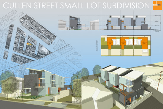
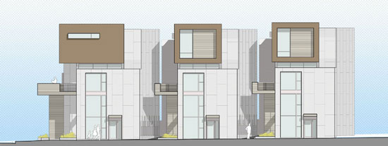
The plan in question is the top floor of Unit #3, the unit with the corner window in the foreground of the bottom right rendering.
These design sessions are very informal and typically consist of two of us hovering over the third person's computer screen blurting out comments.
"Move that wall over 6 inches left."
"OK, now let's try to fit the shower in that corner."
"Are you crazy? You can't put the shower there. We can't plumb that and it's a privacy nightmare!"
"What if we flip it to the other side of the room? Let me see it in 3D."
"That's better. Let's make that an option."
Arguments develop over seemingly small things like how many dressers people like to have in their bedroom. These often heated conversations are all in the name of great design. I think the tension is a good thing.
Average design is quiet. It rarely moves people to take a real stance.
Even something as simple as a master bedroom floor plan revision goes through this filter. Three (or more) design opinions pushing to make it better. These modern homes are small. Well designed floor plans are critical.
Here's a look at the multiple floor plan options that came out of this particular meeting of the minds.
Floor Plan Option 1 - The Original
This is what we started with: a floor plan with some problems. The wide "X" at the bottom of the room is an open-to-below space, meaning it's open to the living room below. Very loft like. We love open-to-below spaces in our homes; however, in this case. it was creating problems. The (low) bed wall was too short and the access to the office nook was awkward. There were other issues as well, but I'll spare you those details.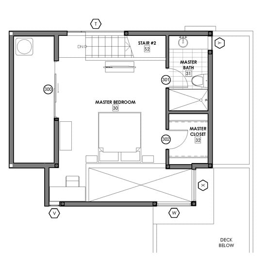
Floor Plan Option 2 - The Big Bedroom
The simplest solution to the issues in the original plan was to expand the room downward, closing off most of the open-to-below space. This, however, created a bedroom that was a bit large. If someone wanted a TV in the bedroom, they'd have to put it on a side wall because the wall across from the bed was too far way. Even more of an issue is that most people would rather have a larger bathroom and closet with this expanded space, not just a huge bedroom.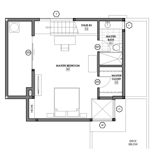
Floor Plan Option 3 - The Vestibule
So that led to Option 3, where we moved that bathroom over to the expanded space. This allowed for a larger bathroom and closet. We also added a little vestibule area with a linen closet. The shower has a little window into the bedroom - how sexy. The whole bath/closet area can be closed off with a barn style sliding door. All the spaces have lots of natural light.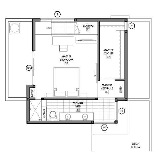
Floor Plan Option 4 - The Voyeur Shower
Similar to Option 3, but we moved the shower to the corner glass window. I know, very voyeuristic. I wasn't a big fan of this shower location, but it did create enough room for a tub in the bathroom.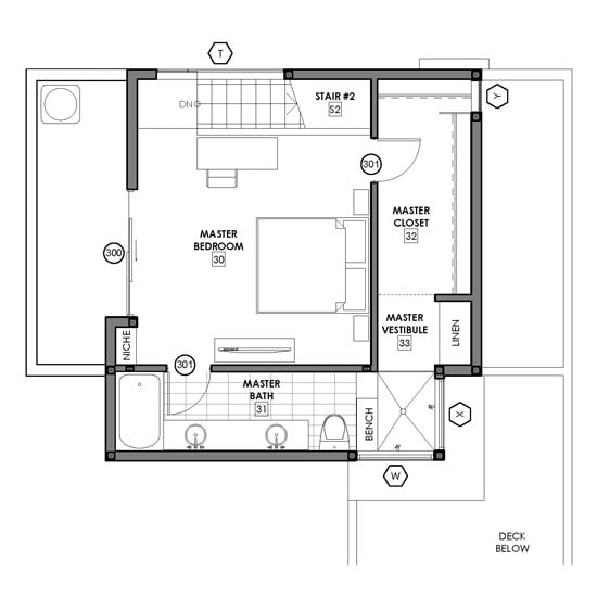
Floor Plan Option 5 - The Big Bath & Closet
In this option we flipped the closet and shower locations. This created a large bathroom and closet. It's a technicality, but it's much easier to run the plumbing with the bathroom in this location.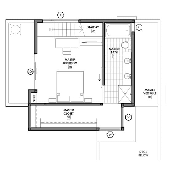
Floor Plan Option 6 - The Flex Space
Here we took Option 5 and reduced the closet size creating a flex area for a desk, exercise equipment, or crib. Spaces like this are valuable in these small urban homes. This option also allows for bed wall flexibility.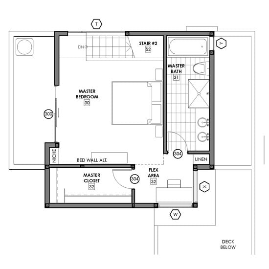
I'd love to get some feedback as to which option you would prefer to live in. And if you'd like to offer up more than just a vote, feel free to leave a comment.
In several days, I'll reveal which option the clients selected.


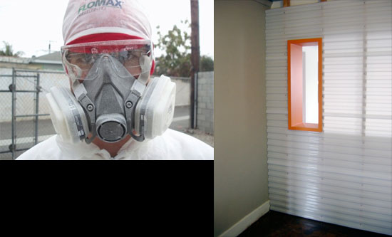
 Just thought this post could use a pretty picture. It was either this or a cheesy stock photo of business people shaking hands.


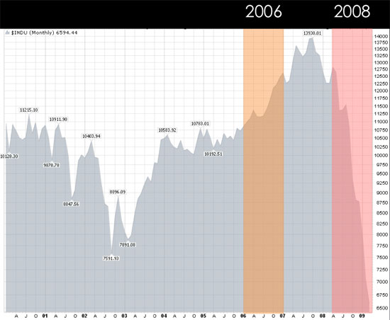
 Modative's founders, February 2006, at the Disney Concert Hall in Los Angeles celebrating at the end of our last day working for other people.
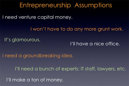

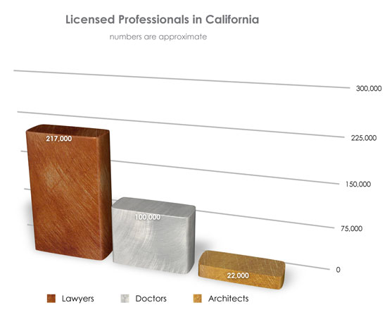
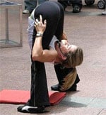
 This group has been educating us on what it takes to be become a licensed doctor in dramatic, scandalous fashion.
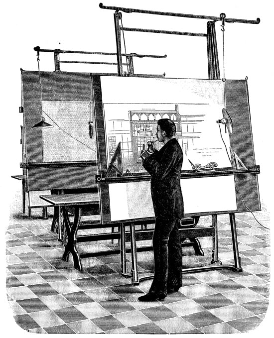 Is this still how the public perceives architects? It would really hurt my back to work like that. Image from