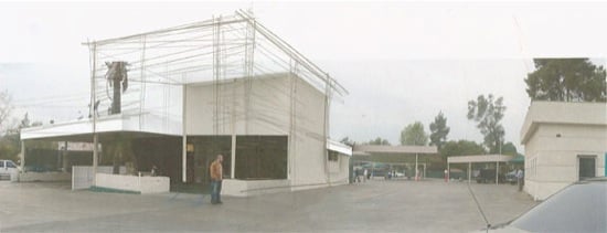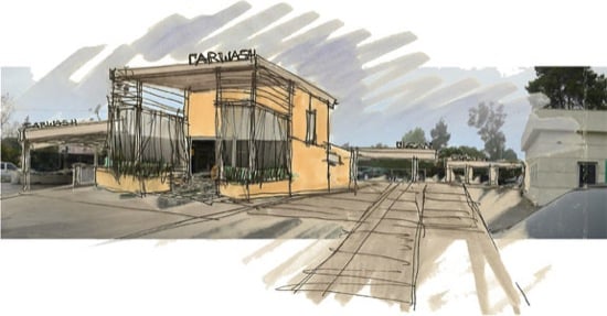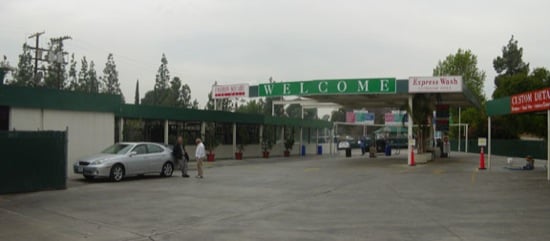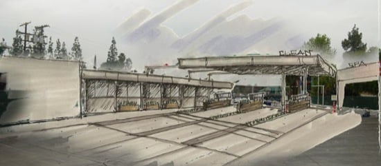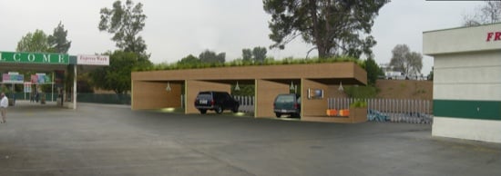
The ever critical car wash store is much more than just a place to pay for your car wash. If the architecture and interiors are done correctly, it can turn the chore of getting a car wash into a pleasant shopping experience.
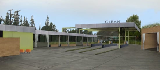
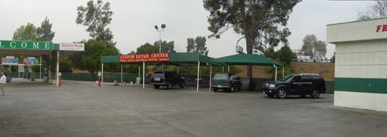
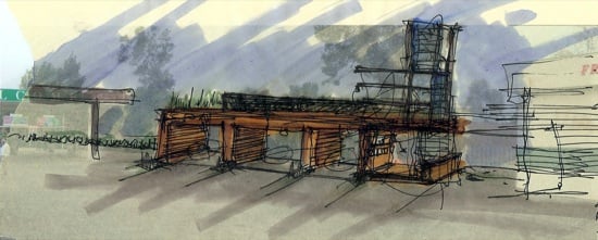
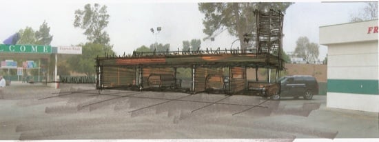
This first round of design for the car wash store interiors was intended to reflect the concepts used on the exterior (see previous post): the screen, simple signs, and improved flow.
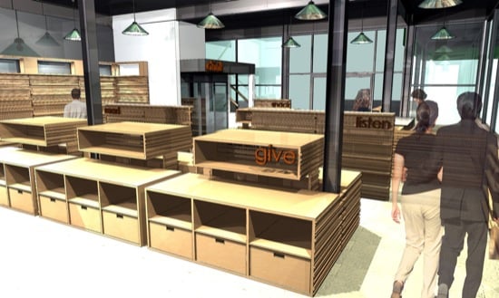
The cabinetry is composed of stacked pieces of wood of various widths that provide different shelving depths, dramatic shadow lines, and visually relate to the screens used on the exterior. Storage areas just below the display areas are intended to ease the merchandise stocking.
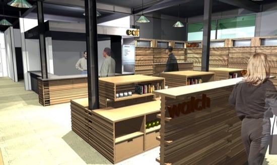
Simple, one word signs such as "write" (cards) and "give" (gifts) were intended to provide a customer with the essence of what was available in that portion of the store.
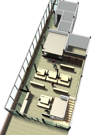
A birds-eye view of the store layout.
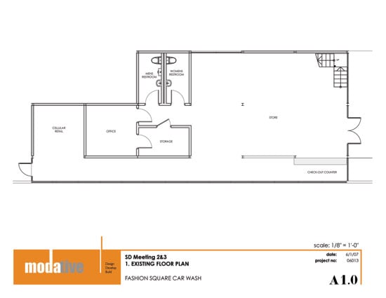
The floor plan of the store before the proposed remodel.
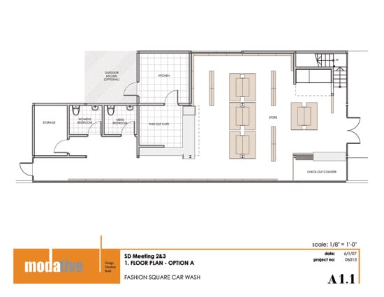
Several layouts were explored and flow diagrams created to see how to
improve the customers experience of moving through the store.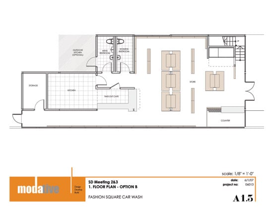
These initial interior layouts included a take-out style cafe.
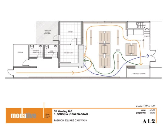
Although the client was very happy with these concepts for the store, the final constructed design of the store is fairly different, matching the reduced scope of the overall car wash project.


