We recently had some photos taken of the Fashion Square Car Wash by photographer Sergio Garza - www.SergioGarza.net.
Sergio shot these for his portfolio, so we didn't interfere and advise him of what we wanted. He had free range to express his artistic point of view. We are pleased with the results. They capture the essence of the place, a busy car wash that is only closed (except for rainy days) one day a year. We also like that he took some pictures of just the landscaping.
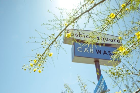 Photo by Sergio Garza
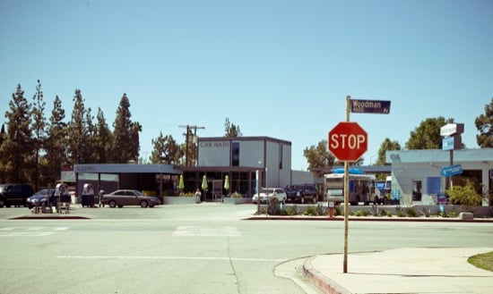
Photo by Sergio Garza
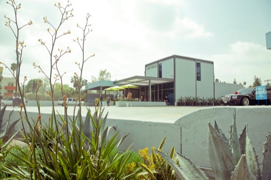
Photo by Sergio Garza
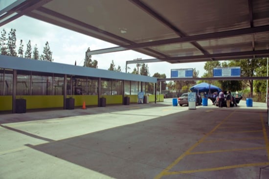
Photo by Sergio Garza
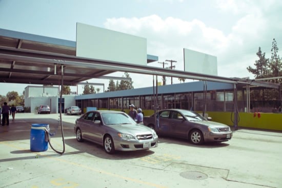
Photo by Sergio Garza
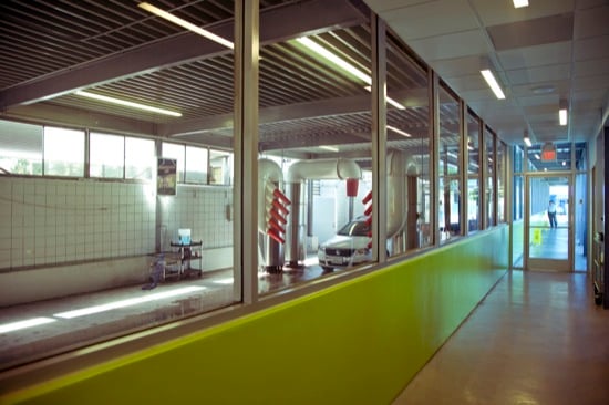
Photo by Sergio Garza
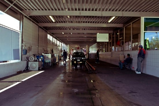
Photo by Sergio Garza
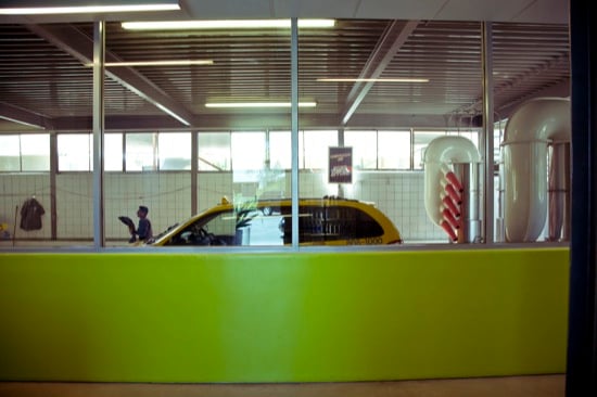
Photo by Sergio Garza
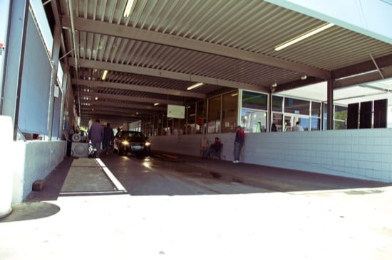
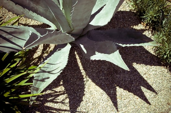
Photo by Sergio Garza
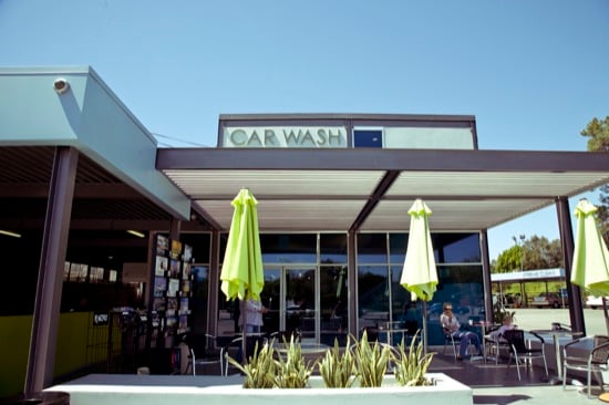
Photo by Sergio Garza
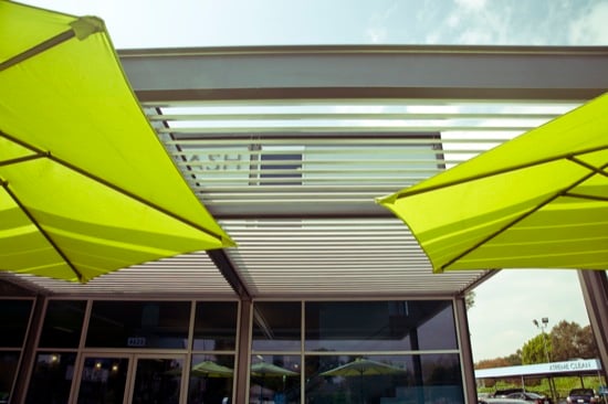
Photo by Sergio Garza
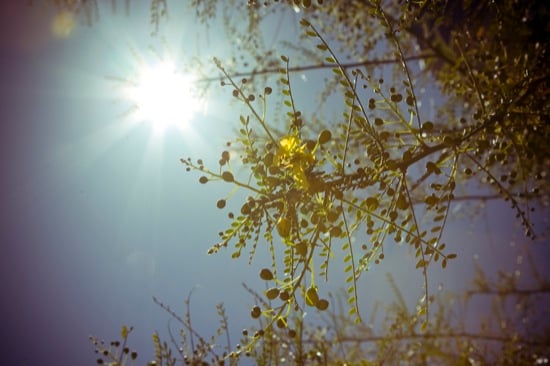
Photo by Sergio Garza
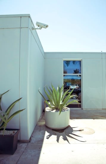
Photo by Sergio Garza
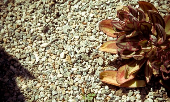
Photo by Sergio Garza
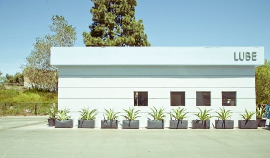
Photo by Sergio Garza
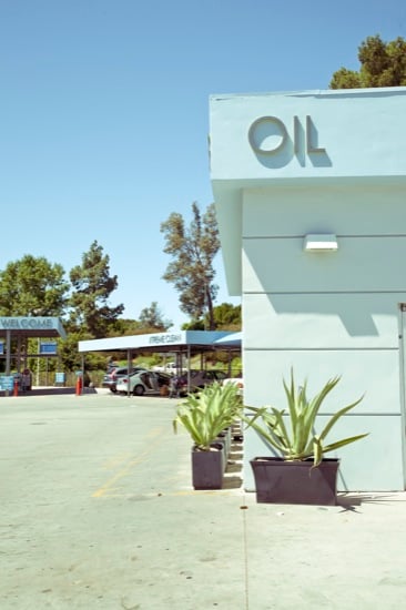
Photo by Sergio Garza
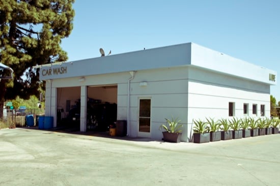
Photo by Sergio Garza - www.SergioGarza.net
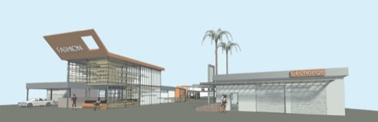
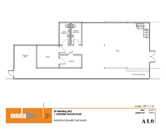
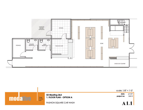
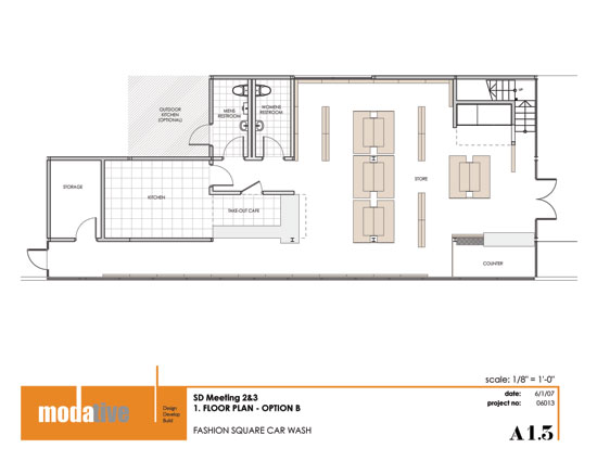
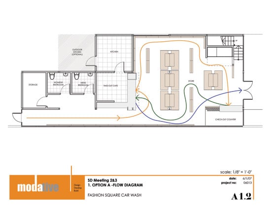
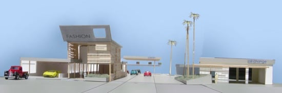
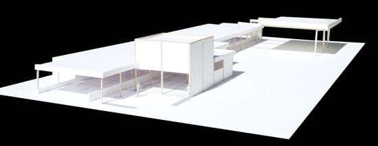
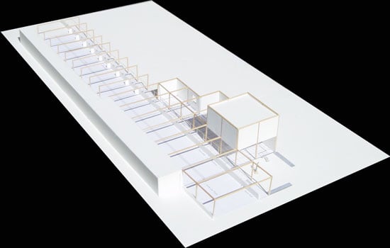
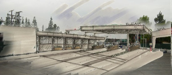
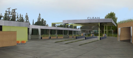
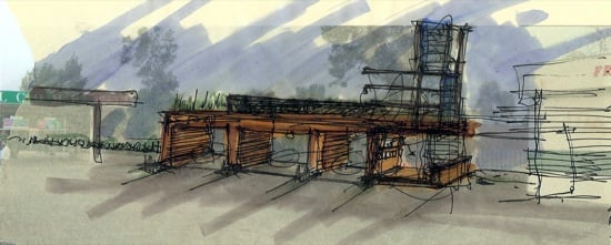
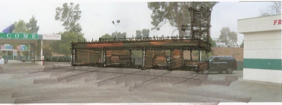
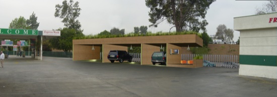
The Fashion Square Car Wash, located in Sherman Oaks, CA (Los Angeles) was remodeled extensively in 2009 by the following team:
Architect - ModativeGeneral Contractor - Pacific Empre BuildersLandscape Architect - Miriam RainvilleStructural Engineer - Ajay Ray
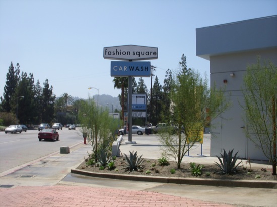
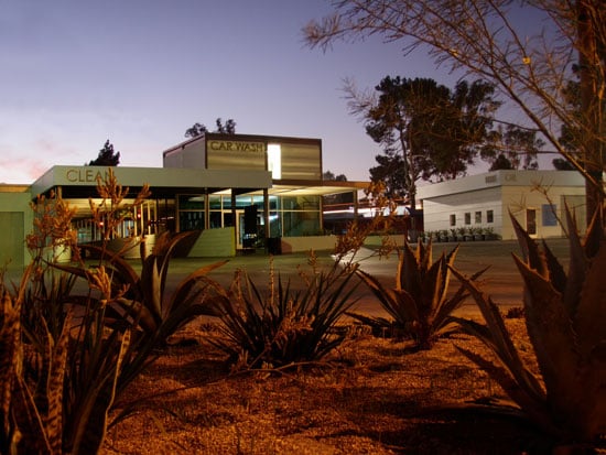 View from the street with the new drought tolerant landscaping in the foreground.
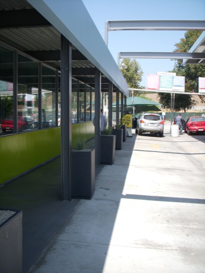
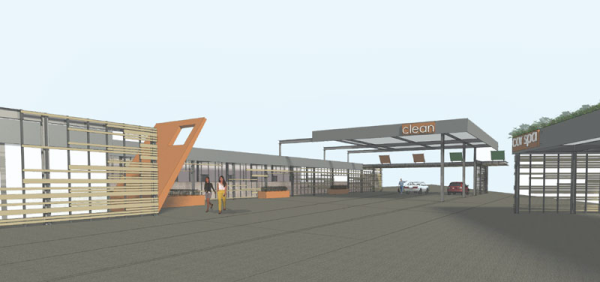
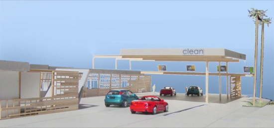
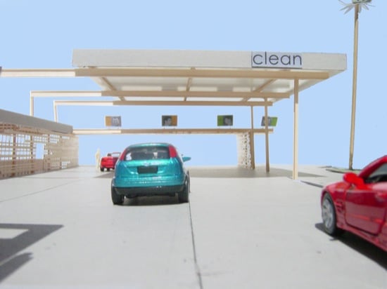
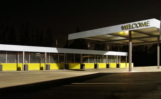 The remodeled car wash ordering area. The only time of day this area is without cars.
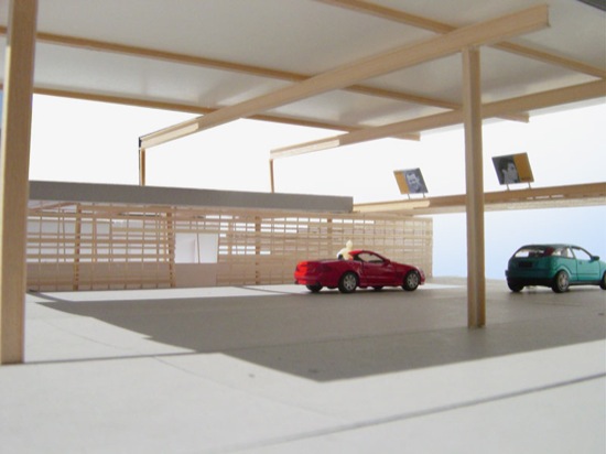
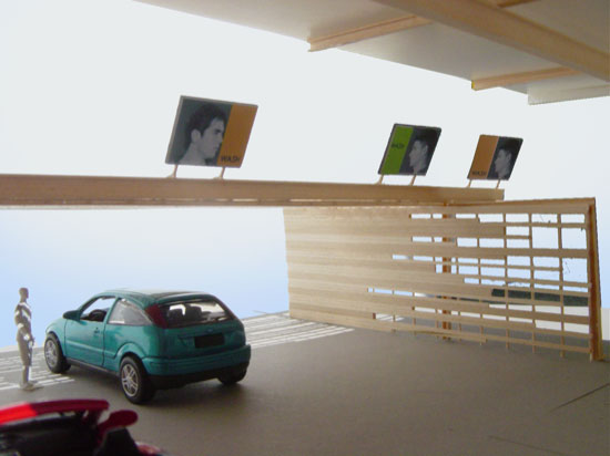
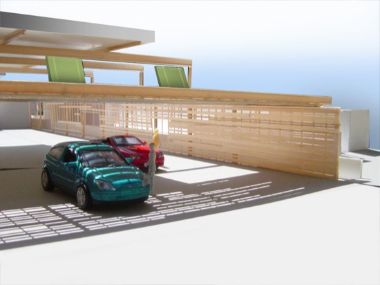
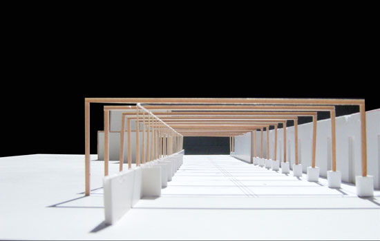
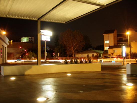 The waiting area and new canopy with aluminum louvers.
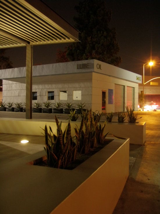 The oil change / smog check building. Work on this building was minimal- new stucco and paint. New planter/benches in the foreground.
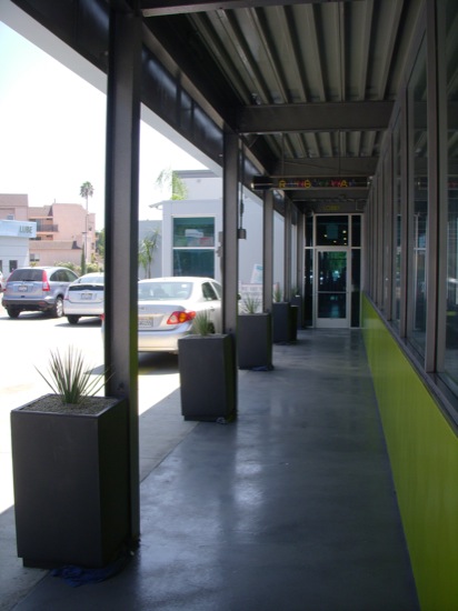
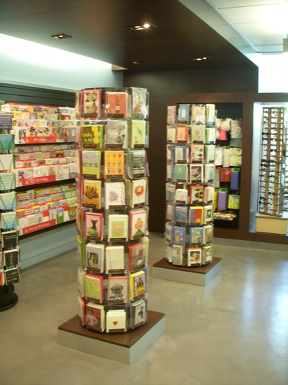
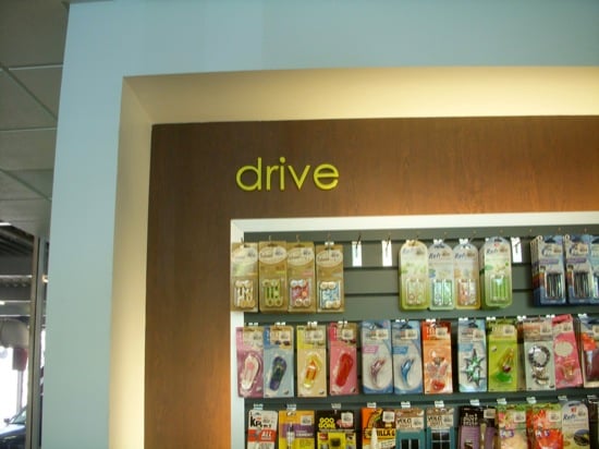
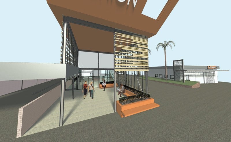
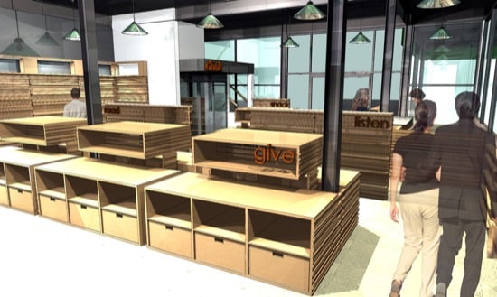
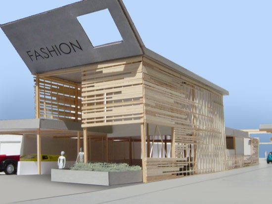
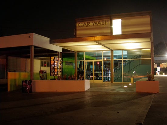 The main car wash building with a peek into the retail store interior.
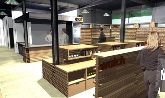
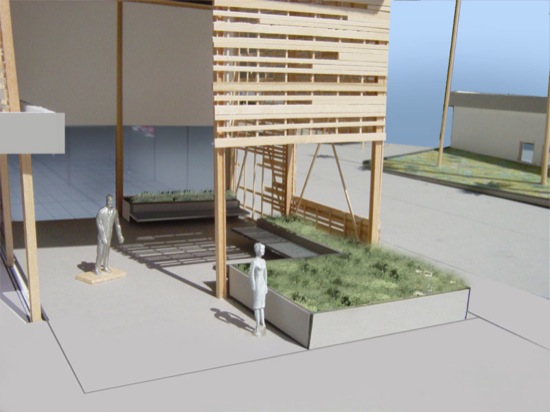
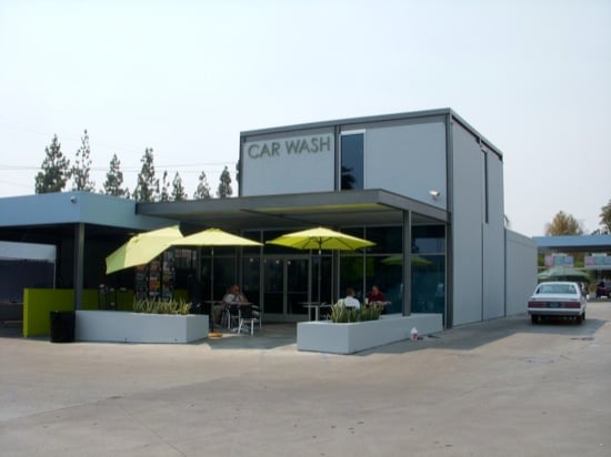 The new waiting area
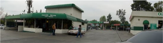
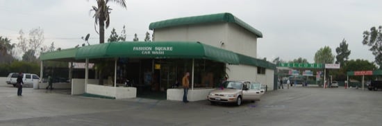 And, just to remind you, the old waiting area and main building
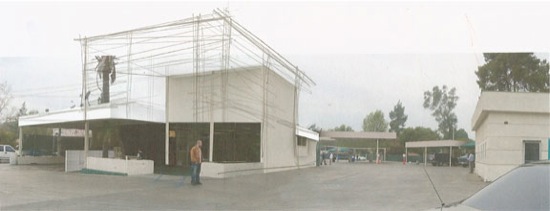
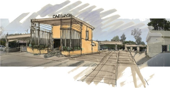
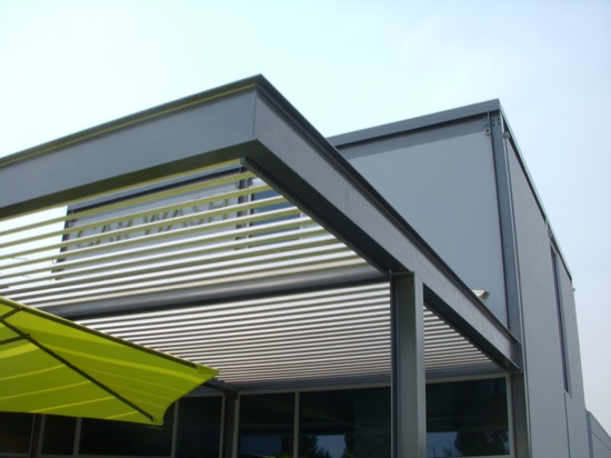 A close up of the new canopy
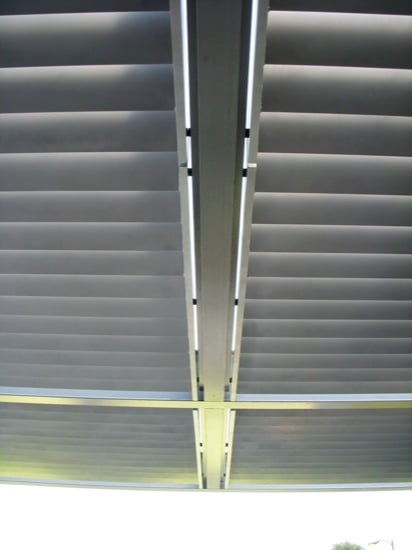
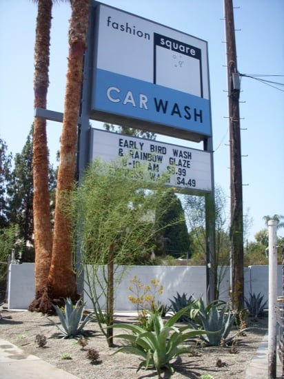
 The sign and landscaping at the corner
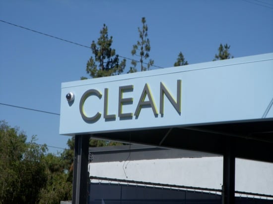
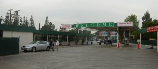
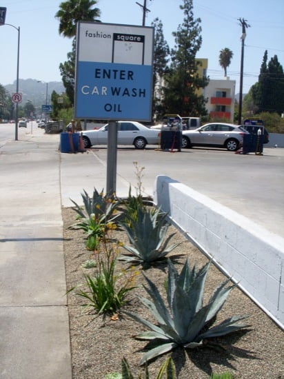
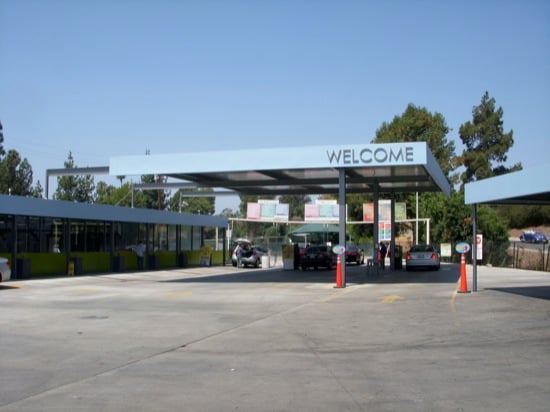 The welcome car wash ordering area
 Before picture of the welcome area
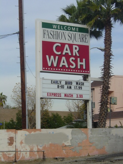